“UX is Not Separate from Business”: 20-ish Tweets About Don Norman’s Complaints About Apple

TL;DR:

[T]he koan to explore here is: UX is not separate from business; business is not separate from UX.

https://twitter.com/devan_/status/633274923776131072
https://twitter.com/devan_/status/633275350475218945
https://twitter.com/devan_/status/633275734006591488
https://twitter.com/devan_/status/633276805697400833
https://twitter.com/devan_/status/633276500557627392
https://twitter.com/devan_/status/633276896428560384
https://twitter.com/devan_/status/633277051055796224
https://twitter.com/devan_/status/633277199500595200
https://twitter.com/devan_/status/633277343918854144
https://twitter.com/devan_/status/633277525171523584
https://twitter.com/devan_/status/633277705463701504
https://twitter.com/devan_/status/633278089167024128
https://twitter.com/devan_/status/633278199292628992
https://twitter.com/devan_/status/633278413894234112
https://twitter.com/devan_/status/633278533452873732
https://twitter.com/devan_/status/633278738344583168
https://twitter.com/devan_/status/633278795273891841
https://twitter.com/devan_/status/633278948449878016
https://twitter.com/devan_/status/633279119422304256
https://twitter.com/devan_/status/633279241782755329
https://twitter.com/devan_/status/633279385471164416
https://twitter.com/devan_/status/633279645278990340

Designing Formal Usability Studies

Last month, I presented on designing formal usability studies at the UX Pittsburgh (which is also on Twitter). By request, I’m sharing my slides and lightly adapted slide notes here. 

You can Google many of these things and find out the good ways to do anything, but what’s hard when you’re starting out especially is to figure out how to think through the best practices as they apply to your own project. I’m going to present one loose framework for doing that. You should consider this as much a point-of-view piece as a how-to.

I also want to encourage you to ask questions. Just shoot up your hand and I’ll call on you once I’ve finished a thought or sequence.

Why am I here?

That is: Why am I doing a formal usability study? For most people doing a formal study, the question amounts to, why not guerrilla testing? We in this room probably all understand the value of some kind of usability testing.

It’s a good question. There’s too much money on the table not to ask about it. I should say I come at this largely from a consulting perspective, but I think the considerations are largely the same for in-house UXers. Also, “formal” vs. “guerrilla” is in many ways a spectrum, so much of what follows will just help you figure out where on that spectrum your next round of testing lies.

Good Reasons

This is the best reason: The project really needs it, for some combination of reasons like these:

  • Less bias…
    • …especially when the tester isn’t on the product team
    • …especially when the tester is a practiced facilitator
  • Qualitative rigor: a thorough analysis process, a comprehensive report with recommendations and theoretical/“best-practical” underpinnings.
    • Some useful quantitative measures possible with more participants all running through the same study
  • More direct observers, like…
    • designers
    • business owners
    • engineers

These things typically come into play on really big projects and in a shorter-term consulting relationship, where the usability researcher isn’t likely to be paid to stick around through the remainder of the design and development process.

Other Reasons

Clients & bosses: They sometimes mistakenly think they need formal testing, and they won’t take no for an answer.

Stakeholders: Sometimes they don’t understand qualitative research and the value it brings, so they demand a quantitative component that just isn’t worth trying to shoehorn into a leaner guerrilla process.

Consultants: There’s more money in bigger projects. That’s enough reason for some people to push for formal testing. It’s usually self-deception rather than evil.

Where am I going?

As you make your planning decisions, you ought to have a very strong sense of direction, as indicated by a few things.

(This is that framework I mentioned.)

The five factors: Goal of the study, broader project process, artifact fidelity, budget, and timeline.

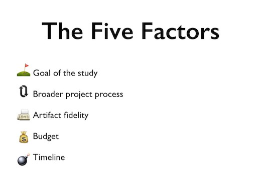
Let’s call these the five factors of study design, and let’s nail them down before we start planning.

(1) Goal: Why are we conducting the study? Is it to prove there’s a UX problem? To validate a design solution? To align the team?

(2) Broader process: Are we part of a long, waterfall design project? Or are we doing standalone usability testing, akin to an annual physical?

(3) Artifact fidelity: Are we testing a live website, a set of wireframes, or something in-between? (Don’t formally test low-low-fidelity designs. It’s not worth it.)

(4) Money and (5) timeline: How much of each do we have for things like recruiting, testing, data processing, analysis, and reporting?

We’ll come back to these several times, which is why I’m showing you these horrible emoji.

How do I get there?

Now you know why you’re doing a formal usability test, whether you feel good about those reasons, and where the project needs to go.

In other words, the easy part is over.

Making your plan: Basic study configuration, location and tools, participants, task design, and artifact prep

Time to make the plan. Here’s what we need to think through.

Basic study configuration matrix: moderated or unmoderated against in-person or remote

Note: “Remote” here means “using an online platform like usertesting.com” or “sitting in the next room watching through a glass or CCTV.”

  1. In-person, moderated
    • Classic (in part because the technology wasn’t there for the others when the method was being developed)
    • Gives you great insight into not just task completion but physicality and demeanor.
    • Lets you probe (with care) into behaviors and desires.
    • Relies tremendously on the skill of the facilitator.
  2. Remote, moderated
    • Saves costs on travel, space, or both.
    • Lose some—but not all—of the benefits of in-person (moderated) testing.
    • Mostly, a little harder to “read” a stranger from a distance.
    • But, gain some context—what’s the user’s computing environment like?
    • Also relies tremendously on the skill of the facilitator.
  3. In-person, unmoderated
    • That would just be creepy, to sit there ignoring them like that?
  4. Remote, unmoderated
    • Difficult to position this as truly formal usability testing unless your tasks are very well-organized and straightforward, and you have a platform capable of tracking task completion at a fairly granular level of detail.
    • Can be very valuable for those sorts of tasks, however.

Don’t forget the five factors. Each one should shape how you make this decision. For example:

  • If your study’s objective includes testing emotive responses to a product, you should avoid unmoderated testing, because getting deep into the subjectivities of a session usually takes more active probing by the facilitator.
  • If for some reason you have a week to get your test done, remote unmoderated testing can be a lifesaver.
  • If you know you can’t do any more user testing before launch, in-person, moderated testing might be best, as it often yields a more comprehensive results set (again, depending on what kinds of things you’re hoping to test).

Location and tools by quadrant of the matrix, as described in the following text.

This is a non-comprehensive list. There’s a *lot* out there especially in terms of tools and the list grows quickly; you’ll have some research to do when you get to planning this stage.

  • In-person, moderated
    • Morae: Heavy-duty, expensive, feature-rich Windows software
    • Silverback: Great, cheap Mac software with a history of steady improvement
    • Neutral space: Avoid having them see the product company’s logo in the environment
    • Inviting space: Be cognizant of accessibility, perceived safety, physical comforts. Also: Men, try not to be there alone with a woman. Find a woman to join you even if she just does unrelated work all day.
    • In-home: Great to better understand context (and save money); hard sell for strictly formal studies however.
  • Remote, moderated
    • A lot here. Get creative and test the Dickens out of both your solution and your instructions.
  • In-person, unmoderated
    • (Again, don’t.)
  • Remote, unmoderated
    • I’ve only used usertesting.com, and it’s great for this kind of study. Attendees tonight may be interested in trying Loop11. Nielsen Norman Group has a nice run down from this summer that you could read.

Participants: How many, what kinds, compensation, and recruiting

How many?:

  • Goal: How credible do you need your quantitative findings to be? (They will not be statistically significant under most circumstances.) Do you have skeptics to convince who don’t understand the value or purpose of discount usability engineering? (Google it yourself, lazy.)
  • Process: How many more test cycles will be run before the process is complete?
  • Fidelity: Is your artifact complete/complex enough that you stand to learn more beyond the first five or seven users?
  • Budget and timeline: How many users can you pay? How many hours can you spend? How many weeks?

What kinds?:

  • Goal: Are you testing things that require domain expertise? Do you need to cover certain demographics to make your business case more compelling? Do you have personas that you’ve mapped to a specific product / feature set / task set? How important is a diverse participant set to your project? (And, diverse *how,* exactly?)
    • Whatever it is you want to test, your study may not be well-served by people in (or near) the industry. You’ll have to decide exactly what that means based on the nature of the product and project.
  • Process: Again, how many more test cycles will be run before the project is complete?
  • Fidelity: I can’t think of a case where fidelity of the artifact should influence whom you recruit.
  • Budget and timeline: See “How much to pay them?”—and also, if you’re short on time, you won’t likely be able to recruit 18 employees of small startups in Pittsburgh making over $85,000 per year and who prefer decaf.

How much to pay them?:

  • The going rate changes. I’ve paid between $50 and $100 recently. You may have to pay a bit more to get people of higher socioeconomic status, but you should pay all participants in a given study the same amount. Value their time equally, even if they don’t.

How to find them?:

  • Carpet-bomb your friends and family (though you shouldn’t conduct any sessions with people you know for a formal study), any professional contacts (again, likely from outside the industry), and your social-network connections.
  • Or, for an even more formal approach: Use a recruiter. Plan to spend between $75 and $150 per participant (as of late 2014), depending on the complexity of your participant set and whether you want just a preliminary recruiting effort from their database or end-to-end recruiting and scheduling.

Task design graph: intensity against complexity

Your overall approach should account for the five factors first:

  • Study goal: all tasks in support of your objectives; your most critical objectives prioritized.
  • Broader process: a suite of tasks that neither exceeds the moment nor fails to make use of it.
  • Artifact fidelity: tasks that the artifacts can support.
  • Money and timeline: tasks that lead to a dataset compatible with your resources for analysis.

But also consider also this chart, showing a hyperbolic view of how participants tend to experience tasks with great emotional or psychological intensity and great procedural complexity (or ambiguity). The moral: You just won’t get good results if you go full-sadist on your participants. You have to keep the overall test experience at least somewhat pleasant or else you can create a falsely negative impression of the product.

More on task design: clarity, verisimilitude, utility

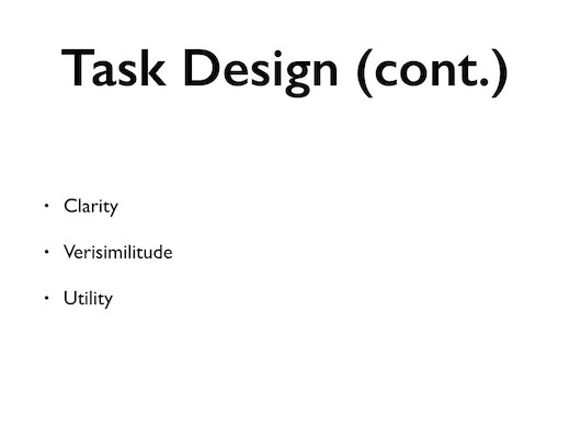
Clarity: They’ve got to understand what they’re supposed to do—or answer. So don’t be vague (“What do you think of this page?” or “Try to figure out what you’re supposed to do on this site.”) Be clear (“Do you see anything that you don’t understand?” or “This site helps you find facial-hair inspiration, and it works best if it knows what kind of facial hair you’ve had in the past. Let’s try to figure out how to upload pictures of your own facial hair.”)

Verisimilitude: Sometimes, the task you’re testing is simply huge—and sometimes, it can’t be broken up into discrete tasks that a user might perform across several sessions. (You might see about changing that, but sometimes you can’t.) So sometimes, you’re just going to have a really long, painful task. But in most cases, aim for something that will reflect what you anticipate real-world task-completion habits to be. Unless your study aims to demonstrate how bad the software is—as many do, in fairness—you don’t want to hear, “That took way too long” over and over when, in real-world use, the task wouldn’t be an all-or-nothing proposition.

Utility: What will running participants through the task really tell you? It’s too easy to waste your time (and your participant’s) chasing data a minor feature you don’t like or a font choice you fought your team on. Any of those things that are problems will reveal themselves anyway, especially with a good facilitator, who will continually encourage thinking aloud and who will notice small issues and probe accordingly if the participant doesn’t speak to them. (Going after your grudges is also a good way to bias the data set, especially if you’re both designing and facilitating the study.) Instead, every task should help you answer a question you need to have an answer to, whether that’s, “Will people enjoy using a site like this?“ or “Will they successfully upload facial-hair pictures?”

Artifact prep: be lazy early, work hard late, and remember your paperwork

Be lazy early: Sometimes, your choice of artifact—whiteboard sketches, paper prototypes, wireframe PDFs, detailed designs—will be determined by the moment in the broader process. To maximize the ROI of the testing, minimize the “I” by keeping fidelity as low as it can be while preserving your ability to test the specific qualities and quantities you’re setting out to test.
Consider not only the present study, but the fact that you’ll have to revise your artifacts (or possibly advance them to a higher-fidelity deliverable) as a result of the test. Using the least-complex possible artifacts for your study will keep overhead to a minimum.

Work hard late: Once you’ve chosen your artifact and prepped your testing flow, however, bust your ass to make sure it all works. Don’t let your first participant be the first or even the third person to run through your test. Catch all the bugs / inconsistencies / flaws you can. Many of these will not be flaws in your proposed UI, but flaws in your artifacts or your task design. (“Oh, right, I forgot to replace the greeking in that callout.” or “Oh, right, that question is prohibitively unclear.”) These issues have a way of getting magnified in the actual study and noisily clouding out more important results. Catch the low-hanging fruit on your (plural) own and protect your study’s ROI.

In fact, if you have time, first secure yourself an expert review or run a heuristic evaluation; see my own “Beyond Usability Testing”—and don’t miss some important clarifications in the comments.

Paperwork:

  • discussion guide
  • quantitative sheets (e.g., SUS)
  • consent form / anonymity and privacy statement
  • receipt for compensation

What does my future hold?

This stuff may not be part of study design per se, but it’s worth touching on, because you can easily render your study worthless or, more often, detrimental to the ultimate product without thinking through it.

After-testing activities: analysis, reporting, more testing

Analysis:

  • The goal is to let the data speak as directly as possible, with as little interpretation as possible from any particular subjectivity. Rigorous qualitative data analysis with several reviewers is time-consuming but it goes a long way towards removing bias. It’s very easy to think you know what your data are telling you just by having run some or all of the test sessions, but you really can’t. Outside reviewers (not involved with product design) are even better, and are often worth paying for even as an independent consultant.
  • What data to analyze? Could be videos, transcripts, or notes. The closer to the beginning of that list, the more time it will take—but the more objective and comprehensive the results, potentially.

Reporting:

  • You could…
    • …report out the top five issues in a single slide
    • …write a 150-page report with charts, screenshots, links to video clips, participant quotations in callouts, opinionated footnotes, and Dilbert comics used by permission
    • …do anything in-between, or some combination
  • Generally speaking, level of investment in the study will help determine what your clients, bosses, or stakeholders expect in terms of final deliverables, but you should obviously be as clear as possible about that with them up-front.
    • Also, one level or another may be justified by other of the five factors. For example:
      • As a consultant looking for repeat business, you may want to do as much work here as you can reasonably do in order to prove your value (without setting up unreasonable expectations for the future).
      • You may be testing such informal artifacts that a long report would be a waste of time (as compared to moving on to the next round of artifacts).
      • You may know that this is the only user testing that a product will see for some years, and you may want to be sure your stakeholders can use your report to build-out a medium- to long-term roadmap of improvements.

More testing:

  • Depending on where you are in the process, fix the issues you found and test again. It’s rare that it’s worth conducting two formal usability studies back-to-back, but it’s equally rare that a formal study is the best last step in a product design, redesign, or optimization process. So you’ll probably look to guerrilla testing or other discount methods next (depending on your reasons for conducting a formal study in the first place). Go get ‘em!

WTF??!

[In the presentations, I asked for questions and we had a lengthy, lively, and productive discussion. Feel free to do the same in the comments.]

Not-not-design: Confessions of a Terrible Designer

I’m a terrible designer. I’m an amateur with Adobe Creative Suite, I know almost nothing about color theory or typography, and I don’t—in fact, I can’t—make your website or software interface “pretty,” a role often rightly understood as the designer’s. I’d guess that at least three-quarters of my work isn’t even meaningfully visual; I spend most of the day reading and writing, talking and listening.

The problem is, I’m a senior designer at a well-respected healthcare software firm.

My boss likes to call what we do “‘Big-D’ design,'” a term architect Larry Barrow seems to have coined. That means we don’t just (“just”) crank out detailed designs and styleguides, but we also tackle all the research, analysis, and communication that leads up to that final step. It’s a nod to the importance of the thinking behind the final design deliverables—also leading to the concept “design thinking,” popularized at IDEO and Stanford’s d.school.

I like the idea of elevating design’s reputation among non-designers into Big-D territory, but the mere addition of a capital letter doesn’t communicate how much worse I am at the lowercase version than my colleagues. So, I’ve also taken to explaining that my work is “not-not-design,” a less intuitive term, but a productive one in that it allows me to tell a good story:

In one of the interviews for the job I have now, I was feeling skeptical that I could or should end up in a design position. As I showed one of my wireframes, I wanted everyone in the room to understand that such barebones presentations are as high as I climb on Fidelity Mountain. I said something to that effect, and the design group’s second-in-command said, “But that’s not not design.”

And she was right, that’s not not design. If design is the process of learning about users and business needs and working towards concepts and eventually some visual deliverable, then I’m doing at least three-quarters of that work. What I do is (not-not-)design if anything is.

So why do I have such a hangup? Why do I feel it’s awkward to be introduced around our enormous parent organization as “the designer on the project?” Why do I need to rally behind a term like “not-not-design” in the first place?

My own problem probably starts with web marketing agencies, where I spent my professionally formative years, and where, until recently, design and user experience (UX) didn’t often overlap as disciplines. UXers worked on strategy and architecture; designers tackled the visuals and brought the interactivity one step closer to its eventual life in code. In the best cases, the two might collaborate some as they worked. Sometimes there’d even be a developer at the table.

The UX field does also have a well-documented terminological problem (OK, one more), which is that even those of us inside it don’t often feel certain what it means to call ourselves UX designers, architects, or strategists. It’s easier for some firms, like my current employer, to sidestep that question by just calling everybody “designer,” and to explain the depth of that term later. It’s just that between the moment when somebody sees my business card and the moment when they learn what I do (and do not), I feel a little bit like a liar—and perhaps a little bit undervalued, too.

Misunderstanding the role of the designer—ignoring not-not-design, in other words—is bad for everybody. If I were a designer at an agency like the ones in my past, I’d want very badly to get to spend as much time as the UXers do talking to users and stakeholders and poring over secondary research before I even started thinking about layout and type. If I were a UXer at one of those places, I’d want to feel like I had a strong influence on the final visual representation of the product, even if I lacked the skills to help create that representation directly. (In other words, I’ve found a pretty good fit in my current employer.)

I don’t mean to suggest that there’s no value in identifying and articulating the differences among these many roles. There is and ought to be a community of people talking productively about how to do better work in the areas that will probably always elude me. Likewise, I like talking and learning about things that may never interest some of those people.

All I’m saying is, despite my protestations in the job interview, I do belong on something called “a design team,” because not-not-design is design, too.

Also About Those Long Line Lengths

This morning, Tyler Galpin took a shot on Twitter at Stuff & Nonsense’s new redesign:

Yay for completely unreadable line lengths on a screen larger than a laptop. Constraints, dude. http://t.co/jusxIj4H

Andy Clarke defended the design choice, saying, among other things:

I don’t want to put constraints on line-length. That’s not a designers’ job. It’s a user’s job. If anyone wants to change the measure in a flexible layout, they can do it easily by changing the browser window width on their Mac or PC.

By me not limiting line-length, a user can let big text fill their screen and see more of it at a time. A constrained, narrow width would force them to scroll and I don’t want that. If you think my logic’s flawed, or you can think of a better solution, I’m all ears.

As luck would have it, I’m all mouth.

So let’s chat for a minute. Let’s chat about two things that users can do to improve readability, as needed:

  1. lean in to the display
  2. invert the colors of the screen image using OS-specific commands

These acts have dramatically different barriers. The first requires only a minimally functional set of core muscles—no conscious thought or fine motor control whatsoever. The second, some problem analysis, a conscious decision, prior advanced knowledge of one’s OS, and a modicum of fine motor skills, depending. (I still often botch the iOS home-button triple-tap.)

The greater the set of requirements to perform a task, the more the designer should do to prevent the user from having to perform that task. Absent some principle like that, how could we say that, in general, designs shouldn’t feature white-on-black body copy? Or, I don’t know, 6px body copy?

I would argue that the action Clarke empowers his users to take—constraining line lengths by adjusting browser window sizes—has more requirements than the scrolling he’s trying to help them avoid.

Scrolling is easy and barely conscious for many people in many cases. It’s such a fundamental act of web reading that we have many different ways to do it:

  • the arrows on the scroll bar
  • the whitespace in the scroll bar
  • the scroll position indicator in the scroll bar
  • the mousewheel
  • the trackpad
  • whatever you call the top of the Apple Mouse
  • the space bar
  • the down arrow key
  • tapping a phone’s screen and dragging (so easy I do it with my nose when I’m wearing gloves)

And so on.

(Okay, one more: In Instapaper’s iOS app, you can just tip your iPhone or iPad to scroll. Marco Arment seems to have taken scrolling to be so important in developing an app for reading that he wanted to make it even easier. This despite the tap-and-drag’s having been, again, an absolutely fundamental iOS interaction from day one.)

By contrast, resizing a browser window as Clarke would prefer we do requires, first, that we make the conscious decision to do so. Anecdotally, when I make the decision to resize a browser window, it feels like I’ve done a lot more analysis of the problem I’m having than when I scroll, a behavior that I started using in, I don’t know, 1987. I bet you feel more or less the same way.

There are also fewer ways to resize a window. Historically, you could use your OS’s maximize and related buttons or you could grab the bottom-right corner of the window. The buttons probably don’t help Clarke make his case, since they don’t resize with enough control or predictability to be useful in trying to adjust text sizes.

The latter method, grabbing the corner, was such an interface problem—with its small targets and somewhat sloppy, two-axis behavior—that, starting with Lion, Apple decided to change the model significantly. I’m stubbornly attached to Snow Leopard, so I can’t speak to the effectiveness of the new resizing features. (And to be fair, Apple tackled scrolling, too, not that I was jazzed about those changes.) But it’s tough to imagine an argument that resizing is easier than scrolling, the dilemma as Clarke figures it.

All told, if it were my site—and, at the moment you read this, it will be—I would much more readily encourage scrolling than resizing.

Issues with Issuu: An Open Letter to Literary Magazines

Dear literary magazines,

I’m writing you this letter to beseech you not to use Issuu and to explain why I feel so strongly about it. I will be as concise as I can, but the platform has many problems.

Let’s start with the most obvious: Nobody visiting your website on an iPhone or iPad will be able to read the work you care so much about. Issuu uses Flash, and there is no Flash on those devices. (In fact, Adobe has stopped developing mobile Flash plugins for any phone.)

It’s true that Issuu has a reader app for iOS, but that doesn’t help you when somebody clicks a link to your website from their chosen iPhone Twitter app, for example. It only helps if you put your entire publication out via the Issuu iOS Reader (which you probably don’t) and a user of the app decides to subscribe. I’d stake my reputation on that fact that most of your readers do not subscribe to any version of your content—print or, for example, RSS—and won’t likely become subscribers just to see your content in the Issuu reader.

A second, related problem is that Flash is clunky in the Mac OS. It crashes often and is notoriously slow and insecure. Personally, I have had enough seemingly Flash-based problems with Issuu that unless I have a really good reason to want to read some piece of writing presented to me in Issuu—like, maybe my wife wrote it—I usually don’t.

A third technological problem with Issuu is that web searches for content you present in Issuu don’t ever lead searchers to your site. By Issuu’s own admission, because they always host the actual content and serve it to your visitors via your embed code, searches that turn up your content will point to issuu.com instead of awesomelitmag.com.

Maybe someday Issuu will abandon Flash (which it seems like they will have to) and come up with some unique way of delivering to you the search-engine traffic that should be yours (a task in which I’m sure they have no interest). Even then, there would be reasons to avoid them. These are mostly usability concerns, the kinds of things that ultimately cost you readers.

The usability issues that seem to matter most all stem from the fact that reading Issuu content requires switching to a full-screen interface. This makes for a worse user experience (UX) in several ways.

First, it’s a long-held tenet of web usability that the interface must prioritize “user control and freedom,” in the words of Jakob Nielsen, the godfather of the field. (Nielsen’s time-tested software interface design principles have been usefully adapted for the web by Keith Instone and Jess McMullin and Grant Skinner, among others) When a website forces users into a full-screen interface in order to read its core content, it violates this critical principle.

Second, Issuu’s particular implementation of full-screen reading also requires users to learn a new interface. The power of the web lies in its consistency across sites: I click a link; I’m on a page; I’m looking at the content I wanted to see. The browser, in other words, is the interface we have all already learned, and the one that websites should take as much advantage of as possible. (“Follow platform conventions,” writes Nielsen; Issuu doesn’t even use a standard Print icon.)

Issuu's controls
Issuu’s many controls. (Click for a larger version.)

Issuu’s interface includes not only the many little icons and buttons shown at right, but also a set of controls tied to things like your arrow keys and scroll wheel. All of this must be learned by new users, and re-learned again and again by occasional users. In its failure to provide any readily available documentation (like tips appearing, after delay, on rollover; or a single, unobtrusive “Help” link), Issuu also violates Nielsen’s final usability guideline.

Of course, there are plenty of reasons to create a new interface and force users to learn it. Or really, there is one: because you are providing a new function—and there are plenty of new functions you can provide. Tweeting, for example, or playing and pausing a video. Reading is not a new function. Reading is the foundational function of the Internet. It’s the only thing—literally the only thing—that every single browser can handle, right down to text browsers and screen-readers for the visually impaired.

Speaking of the visually impaired, they can’t use Issuu—not if they’re using the specialized browsers developed for them. So if you don’t want to lose them as readers, you’d better be sure Issuu provides their browsers with an alternative form of the content. (I don’t believe it does.) Failing to do that is the smaller-scale moral equivalent of not having a wheelchair-accessible entrance to your building. In a way, it’s worse (depending on what’s in the building), because while it costs a lot of money to pour a concrete ramp, not using Issuu is absolutely free.

Finally, although again it is a fact of the Internet that I will have to click several times to accomplish my browsing goals in any given scenario, it is never a good idea to add extraneous clicks. Forcing users who have just clicked a link (from Twitter, say, or from your home page) expecting to read a piece of writing to click again before they can do so is bad form and likely to cost you readers.

I would be remiss if I didn’t close by offering you a pair of possible alternatives. The first and most obvious is to use whatever web publishing platform you have in place to publish your magazine’s content—not just your blog and your “About” page.

The second is just to link to a PDF or, better, a series of PDFs, one for each piece in your magazine. This latter solution will get you out of some—not necessarily all—of the usability hurdles, and will be far better for both search-engine optimization and compatibility with technology used by the visually impaired (so long as the PDFs are well-formed). I would encourage you only to go this route if you have some very compelling reason to do so, and I can’t think of one.

As I mention it, I honestly don’t know what drove some of you to Issuu in the first place. If you felt like letting me know, I would be more than happy to help you think through (and possibly implement) other alternatives that more specifically address your needs.

Most sincerely,
Devan

P.S.: May I call you “lit mags” in any future correspondence?